 Posted by Gabi Garcia, GD Poetry Reader for 5.1
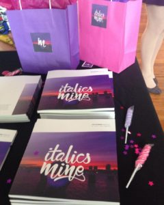
This semester as I was editing for the Gandy Dancer I got the opportunity to review the literary magazine from one of our sister schools, SUNY Purchase, the art school of the SUNY system. The phrase Italics Mine refers to using italics in a paper to emphasize a word or phrase in a quote to bring the reader’s attention to your point. I think I’ve overused this tactic a few times when I was a freshman, so I was pretty excited to see there were other folks who share my enthusiasm for emphasis. What I think is wonderful about this title is that it expresses that there are moments, words, images in our lives and environments that are emphasized by artists and are defining for them as artists (emphasis, much like this entire blog post, mine). I think this journal lives up to its name because that claim for ownership expresses individuality and universality. Italics Mine is a journal that showcases creative nonfiction, fiction, poetry, and visual art and creates a celebratory collage of self-expression. Its mission is to reflect student diversity through art. This journal wildly keeps its promise by including all genres of work from realistic family dramas to noir and science fiction. A reader might encounter gunshots, samurai warriors, or a grandmother’s healthy sex life.
Though only SUNY Purchase students are able to submit, the issues are available online through Issu.com on the Italics Mine website linked above. A reader can also partake in their blog, which includes literary editorials, an interview with mystery writer Susan Breen, and a cute story about a Brooklyn raccoon.
As I flipped through the pages, I was impressed by the stunning art. The art is extremely diverse as well, ranging from humorous to moving or surreal. The last two issues, 13.1&2, are more lighthearted than the issue 12.1&2, and I think that was a good direction for the journal since many of the stories focus on more serious themes like loss, existentialism, change, mental illness, isolation, and complicated family relations. My favorite art pieces included “BRKFST” by Marissa Lovler, a graphic design pattern piece that has all those staple breakfast foods It is beautiful and satisfying to look because it plays with dimension and color. I also admire Victoria Ottomano’s “Creepy Cake Designs by Dad” which is a painting of homemade cake, and Ian Byrne’s “The Annunciation (St. Garf),” a painting which depicts a hooded figure praying to Garfield. These funny pieces are well crafted in technique and concept.
What Italics Mine accomplishes is an exploration and a dialogue between the students. In a country that routinely cuts art programs, it’s important for young artists to keep producing. It’s really nice when your mom frames your poem or painting and hangs it in the living room for your younger cousin who is a member of MENSA to roll their eyes at, but it’s a little nicer to know that your work was chosen for publication.
Alongside the some of the writing Italics Mine publishes interviews with the authors, giving them the opportunity to discuss their process. My favorite moment from these interviews is Gabrielle Bernstein’s answer to “Can you discuss your creative process in crafting this piece?” about her extremely intimate letter to her biological mother “Do you like the Way My Voice Sounds When I Say Your Name?” she replied, “I just sat down with myself and had very deep and fulfilling conversations. I asked myself questions. I allowed myself to really think and feel. I think that’s where a huge chunk of my piece came from. I think artists should take advantage of their mental capacity…to be able to listen to yourself and not judge yourself for feeling some type of way about something that is so complicated. It is all really beautiful.” Bernstein mentions the art department at SUNY Purchase, and I couldn’t help but smile at her love for the people there. Italics Mine is a testament to the importance of giving creative minds a platform and a community.
